Angelya has a great post on how to take a screenshot, with technical information on hiding your UI, hiding names, and principles of composition. Today I`d like to give some pointers on what sort of simple post processing you can do to enhance an image.
You will need: WoW; screenshots; image-editing software (unfortunately MS Paint is not powerful enough for most of these tips). I`m using an ancient version of Adobe Photoshop 7, so the technical commands may not directly translate to your image-editing software. Still, I hope that the general concepts are useful to you!
First, choose the image you want to edit and open it with your software.
Resizing and Cropping an Image
If you want the same image exactly as is, but a wee bit smaller or larger, go to Image > Image Size. I usually use pixels because I have a good idea of how their proportions work, but you can also use inches, cm, mm, points, picas, and columns. If you check the "Constrain proportion" box, setting one dimension will cause the other to change automatically to keep the image proportional. If you uncheck it and put in both dimensions yourself, the image will be distorted.
 |
| Selecting "Constrain proportion" will make the lock symbol appear by the dimensions. |
This is good for when you know exactly what part of the image you want. Hit the Crop tool and select the scene you want. You can drag the crop boundaries around before right-clicking and choosing "Crop". I use this most often for making close-up blog pictures and to remove my UI. If a sliver of UI sneaks into my crop I use the Smudge tool to drag it out of the frame. (More on that later)
REPOSITIONING
This is kind of a situational technique, but I use it often enough for icons and montages that I figured it warranted including. It`s useful for when you know what the dimensions of the finished product will be but not the composition. It`s also good for matching sizes of images and controlling the composition after a resize.
When cropping and recomposing, the first thing to do is create a copy of the image in a new layer. The background layer can`t be repositioned, so we need a copy we can move. Right click the background layer > Duplicate layer. You can rename it, or it will default to "Background copy". To resize, to go Image > Canvas Size. I often make icons, so I usually choose equal dimenions for a square image that can be resized for square avatars. For some reason it defaults to inches as the unit of measurement, so I always have to change it to pixels.
A popup message will inform you that some clipping will occur. This is why we made the duplicate layer - nothing will get permanently deleted since you can move the layer around and access all the parts that don't fit in the cropped area. Now that the canvas is resized, make sure the top layer is selected and use the Move tool to drag it around until you get the composition you want. I always end up with several compositions I like so I save a few versions. Remember that if you made it too small or too big, you can undo your canvas resize.
Changing Color and Contrast
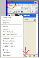
 Photoshop has a wealth of tools and I only use a small percentage of its capabilities. I`ll go in order from most to least often used. I use the new fill/adjustment layer option, which makes it easier to reverse changes because it puts its changes in a layer that can be deleted or hidden, rather than being one change in a long list of edits. (These are reset when you close the image so you can no longer ctrl+Z them; more detailed info on the history list can be found here.) It's found in the Layer menu in the bottom right of your screen, in the middle of the icons across the bottom of the menu. If you don`t/can`t use the Layer Masks, the same changes are under the Image menu.
This is by no means a comprehensive list, but everything can be done by simply dragging a slider around and monitoring the results!
LEVELS
 |
| Before! |
 |
| After! |
Curves are similar to Levels in that you can control the contrast distribution in your image, however the tool is more powerful than Levels. I don`t use it all that often because Levels is fine for me, but I wanted to include some links explaining how it works if you want some really fine-point control.
Levels vs. Curves
Curves How-To
Color Balancing with Curves
HUE/SATURATION
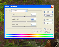
 This option also includes Brightness, but that gets taken care of in Levels and I mostly ignore it. Playing around with Hue, you`ll see that sometimes bumping it up a few points in one direction can add more contrast to an image. Saturation can do extremes - making a black/white image or a pixellated color explosion. In high contrast images, more saturation will make the colors really pop, whereas I find that desaturating by a couple points will add more contrast. I mostly use this for screenshots taken in a zone with a strong atmosphere huge, like Icecrown, Moonglade, and most recently, post-volcano Lost Isles.
BRIGHTNESS/CONTRAST
Again, I ignore the Brightness option, having already adjusted Levels. Contrast will sharpen the lights and darks in your pictures, which can serve to make elements easier to see, or change the mood. It`s also ~super artsy~!
SMUDGE/BLUR
Blur is especially helpful for getting rid of names or other text. Using the Select tool, I put a box around the text I want to Blur. This will keep the Blur tool from affecting anything outside the box. Then, use the Blur tool and smush it around inside your selected box! Using 100% strength and a large brush size makes this a snap.
 |
| Selective Blur |
A note about adjustment layers: When you are finished working with your image and are ready to save, you will need to merge the layers/flatten the image in order to save it as something other than .PSD. You can do this by going to Layer > Merge Visible OR Flatten Image. (These will work the same unless you have for some reason hidden a layer, in which case you will need to make it visible or choose Flatten Image)
EYEDROPPER
The Eyedropper copies the color of the pixel you click on. If Smudge and Blur won`t cut it to remove an unwanted element of an image, you can try to color over top of it! I usually use this when some addon text has snuck into an image. (I`m looking at you, Power Auras countdowns!) Zoom into the part with the unwanted image and use the Eyedropper tool to select a more appropriate color from the surrounding area. Then with your brush you can paint over the unwanted element. If this looks too uniform, try selecting a few more nearby colors and painting dots or lines to match the surrounding texture. This may still look cheesy, so using the Blur or Smudge tools on top of your handpainted area may help blend them with the surrounding colors. The finished version of the image below is here.
 |
| I used the eyedropper in the area circled in red to paint over those pesky Power Auras numbers! |
That`s All For Now
I`m by no means a Photoshop expert, but this is a good simple list of what tools I use and how I use them when it comes time to prep an image for posting! Please let me know if you have any questions, comments, or corrections about these methods.


For those of us too cheap to buy Photoshop and too honest to download a cracked version, GIMP is a great option. It has all you need to edit screen shots,and much more. Sometimes, free is good :)
ReplyDeleteMy dad has been trying to get me to download GIMP for a while! Would you say that the tips in this post translate easily to GIMP?
ReplyDeleteGreat tips, thanks :) The image looks great as a header too!
ReplyDeleteI'll jump in and say that the edits you covered do translate to Gimp, although the colour editing is slightly more basic I think.
Woot! I'm glad you like it. I know that talking specifically about one program can be a turnoff for those who don't use that particular program, but I hope this is useful in some way :D
ReplyDelete